The next three blocks are part of a project to redesign UI (User Interface) from games. These are all examples of ones I feel fail on the basic principles of design, such as whitespace, hierarchy, movement, contrast, etc. The left is my rendition, while the right is the original in game image.


Credit to original image: https://www.google.com/url?sa=i&url=https%3A%2F%2Fwww.pinterest.co.uk%2Fpin%2F429671620674753681%2F&psig=AOvVaw2QRTf674MXuij-PWJz6byc&ust=1608314485330000&source=images&cd=vfe&ved=0CAIQjRxqFwoTCNDinMDM1e0CFQAAAAAdAAAAABAY
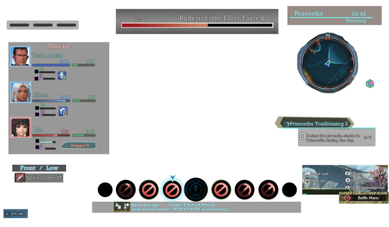

Credit to original image: https://i.imgur.com/i8xnGkG.jpg
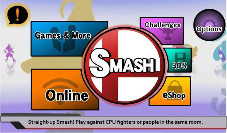
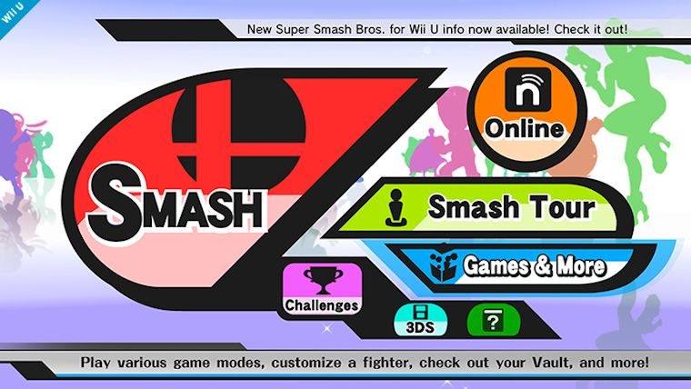
Link to original image: https://primagames.com/games/super-smash-bros-wii-u3ds/guides/super-smash-bros-wiiu3ds/game-basics/wii-u-menus
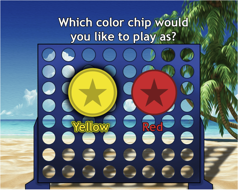
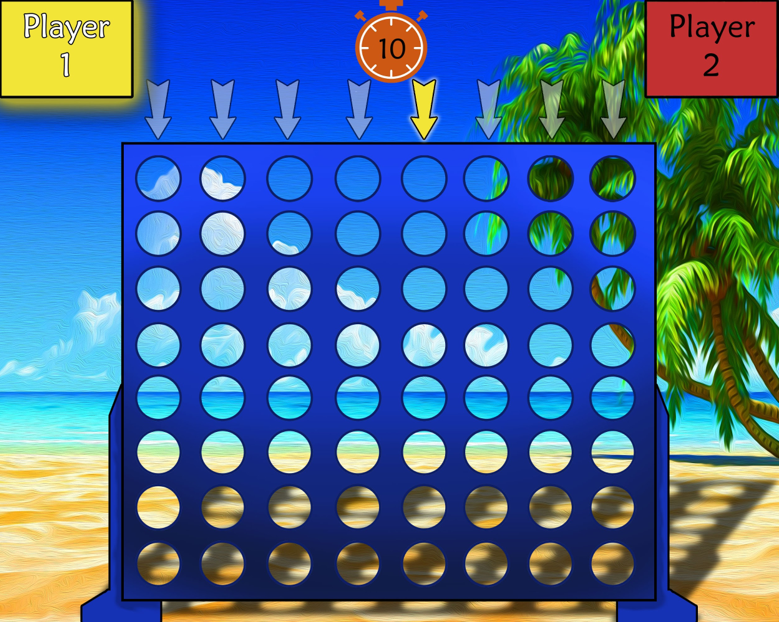
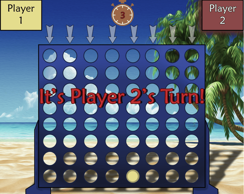
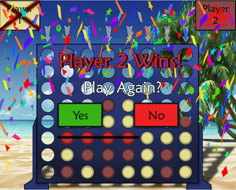
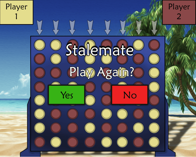
As part of a final project during one of my design classes, we had to make up a game or application that captures UI design. I chose to go with a simply Connect 4 game.
Disclaimer: This is not a real game. All images were made solely for the purpose of showcasing UI design